Metzo Realty
A real estate company based in San Diego, California.
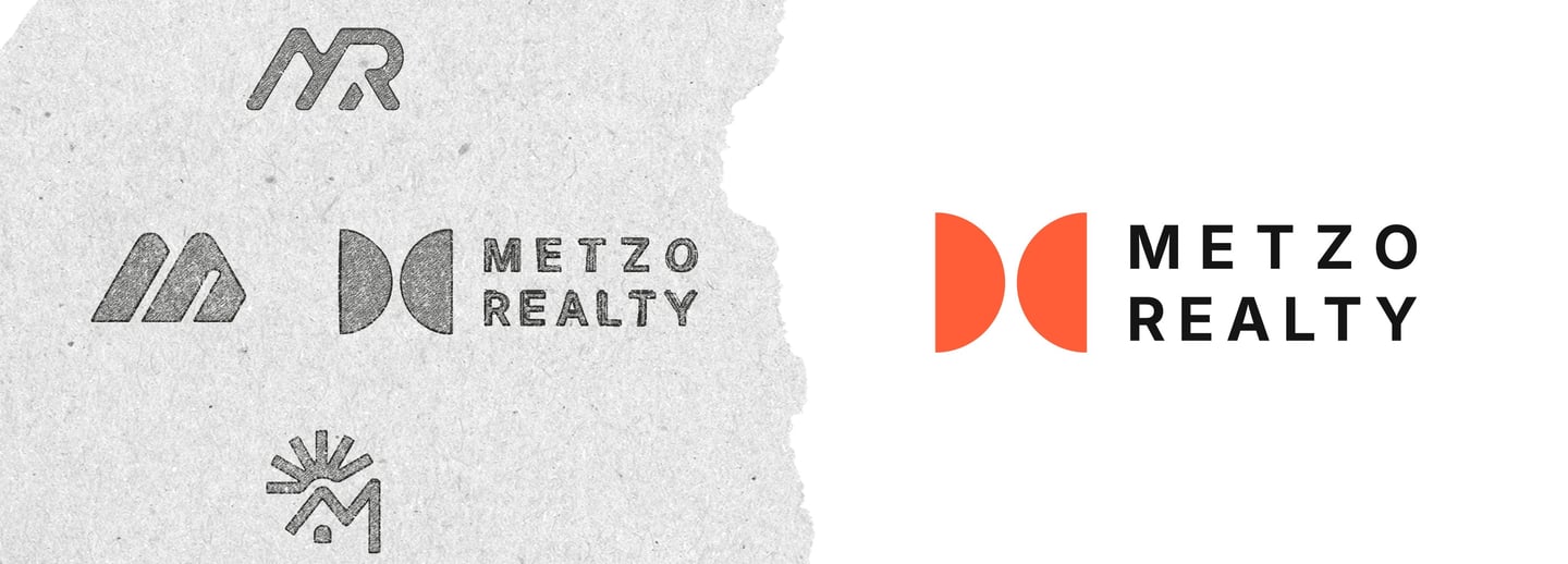
When Luis, the founder of Metzo Realty in San Diego, first approached me, he had a clear and exciting vision. He wanted to launch his company with a premium brand that felt completely different from the competition, which meant avoiding any typical real estate symbols.
During our conversation, I honed in on his goal for a unique and modern identity. My solution was a abstract mark where a divided circle cleverly forms the letter ‘M’. Luis loved how it felt sophisticated and clean, and this logo became the cornerstone for the full brand identity I delivered, including a comprehensive brand guide and all stationery and digital assets.
Metzo Realty: Crafting a Modern Brand Identity
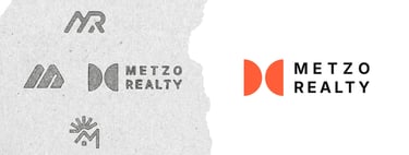
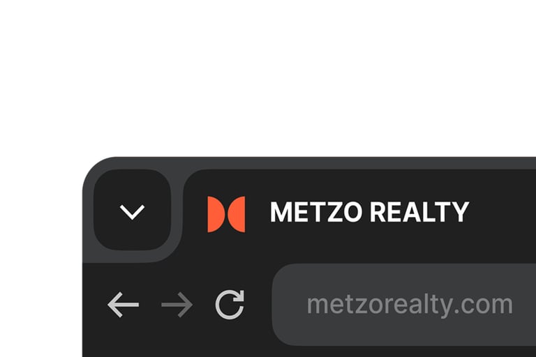
To give the brand maximum flexibility, I created a full suite of logo variations. Alongside the primary logo, I designed stacked and vertical options to ensure a perfect fit for any placement, from a website header to a social media icon.
Logo Variations
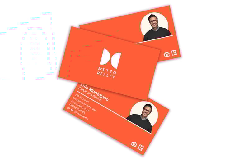
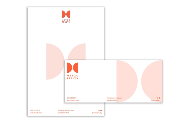
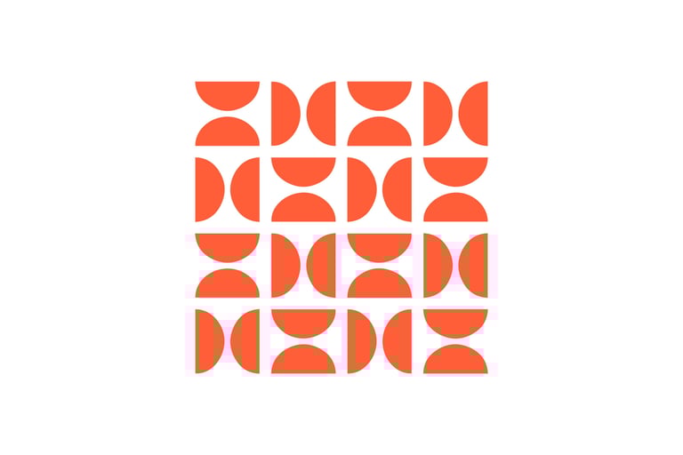
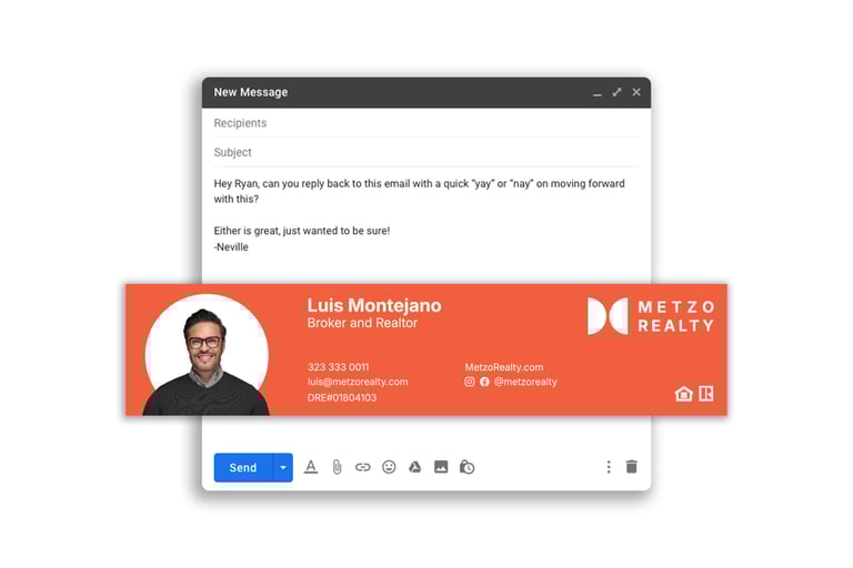
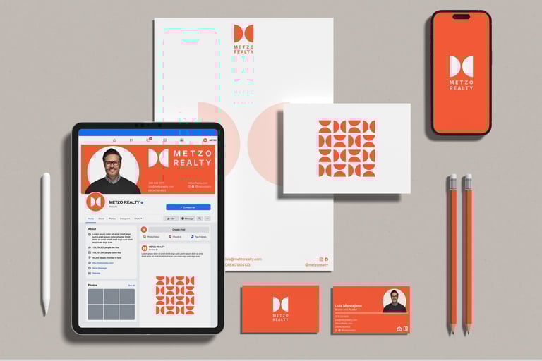
With the new logo set, the next step was to apply that clean, modern feel across the entire brand. I designed a full suite of assets for Metzo Realty, including professional stationery and a matching email signature. To ensure a truly cohesive look, I also developed a unique brand pattern that adds a touch of elegance to all their materials.
Brand Assets
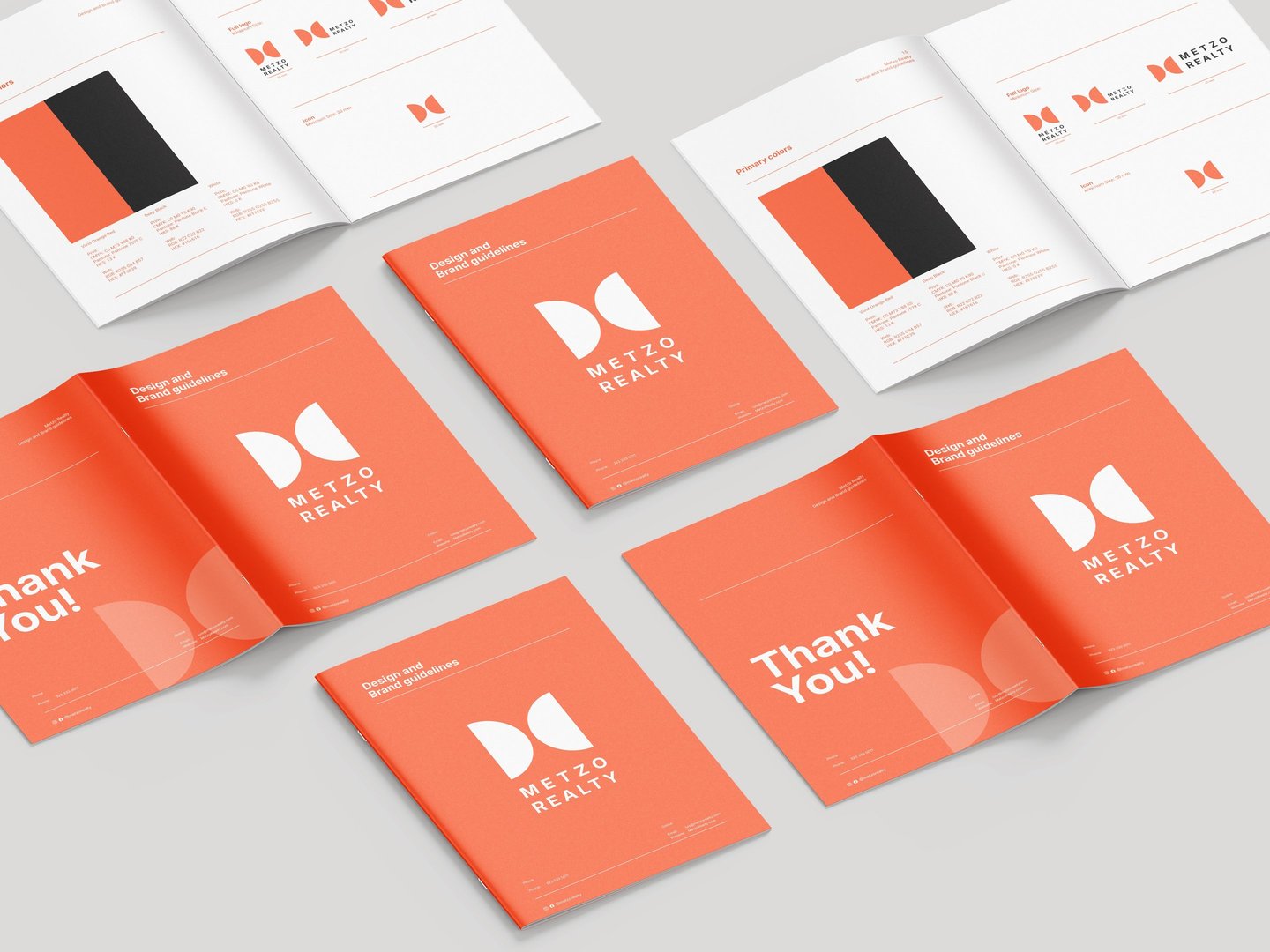
To complete the project for Luis, I developed a comprehensive brand guide to empower the Metzo Realty team. This document provides clear, practical rules for using the new logo, color palette, and typography. It acts as an essential internal tool, ensuring the modern, high-end look we created stays consistent across all their future marketing.
Brand Guidelines
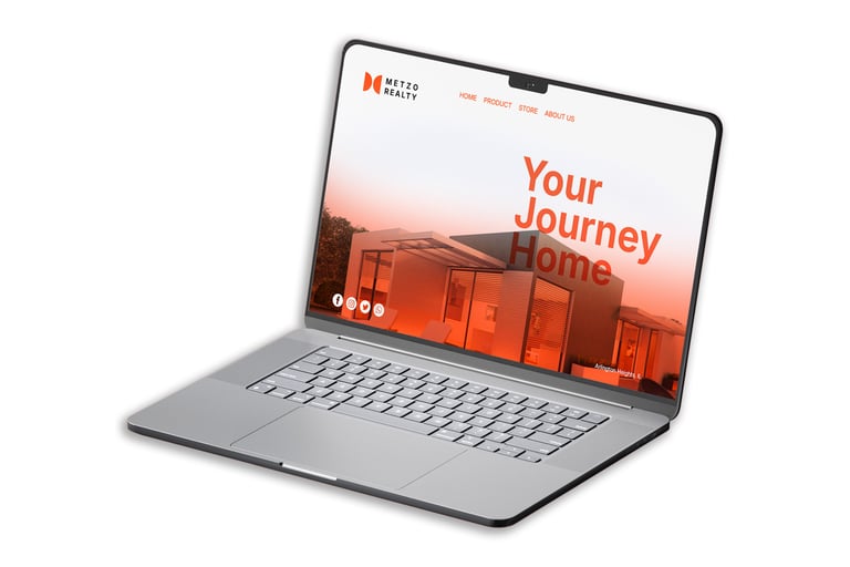
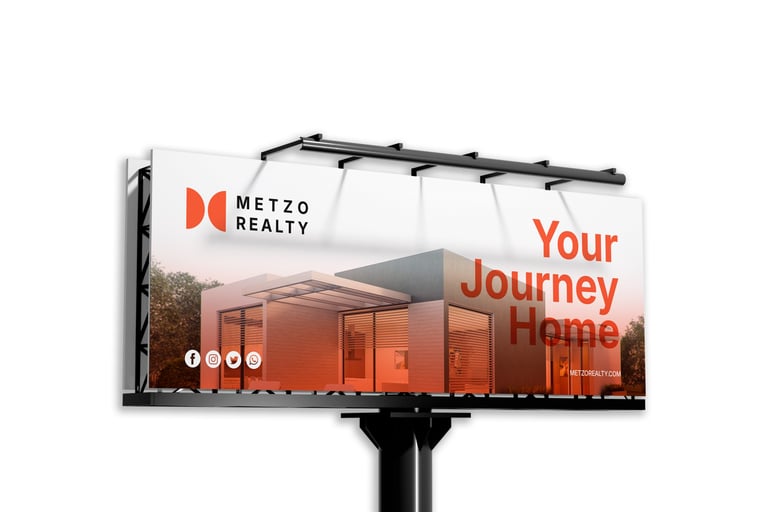
To demonstrate how the new brand identity works in the real world, I created a series of mockups. These visuals showcase how the branding comes together across key marketing materials
Brand in Action
© 2025 Sandun Isuru