Kevin Moore Real Estate (Rebrand)
A modern rebrand for a growing real estate professional
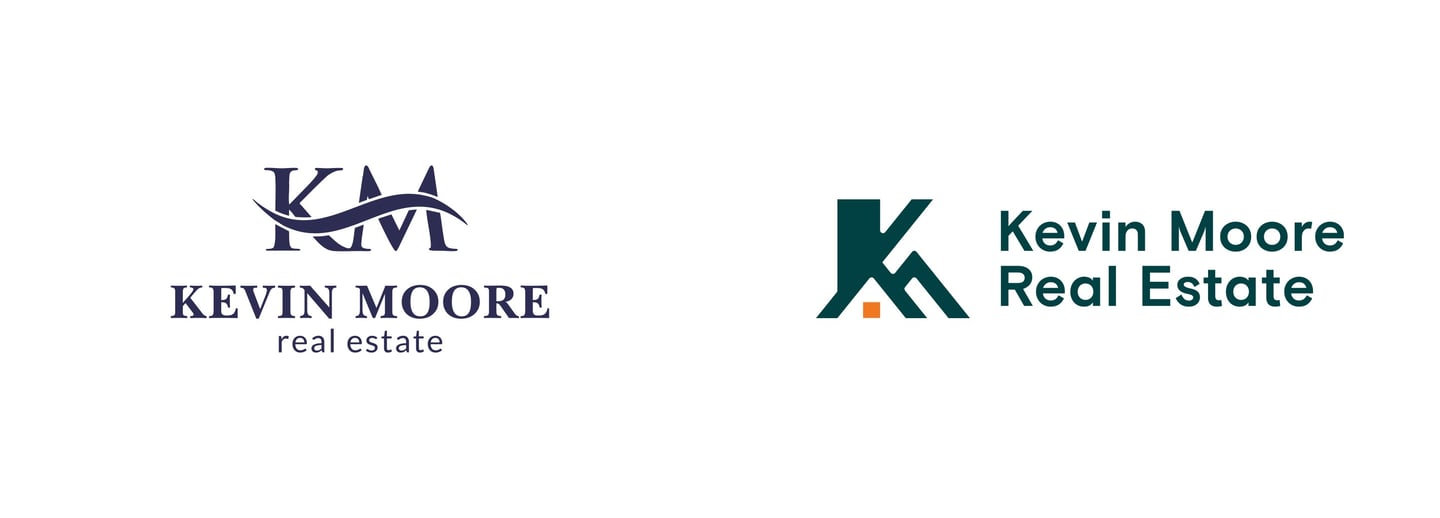
Kevin Moore, an established real estate professional, came to me for a full rebrand. With his business growing, his outdated logo no longer reflected the quality of his service, and he needed a modern identity to stand out in a competitive market. The challenge was to create a new brand that was current, trustworthy, and clearly connected to his work in real estate.
My solution was a clean and clever brandmark that is both personal to him and directly representative of the real estate industry. This new identity gives him the sophisticated and relevant brand he needs to succeed, perfectly aligning his image with the high quality of his service.
About the Brand
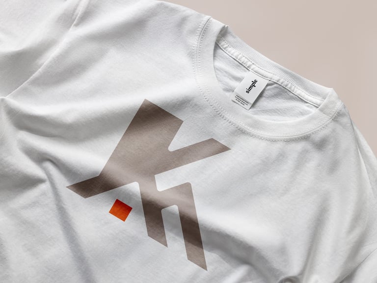
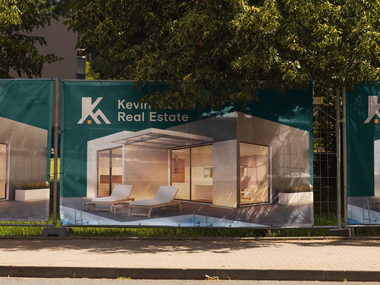
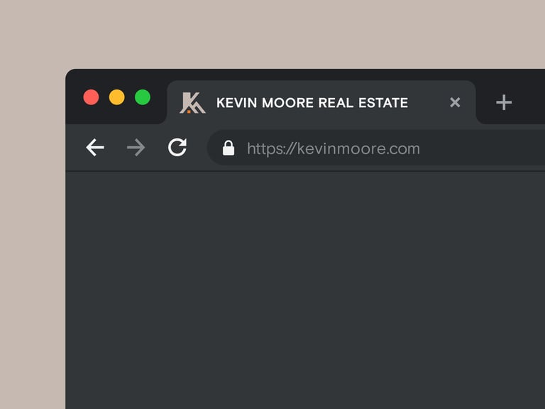
I constructed the logo mark by seamlessly merging the client's initials, 'K' and 'M'. The letters interlock in a way that their lines and angles also form the clean, recognizable silhouette of a house. This approach directly links Kevin's personal identity to his work in real estate, all within a single, memorable mark.
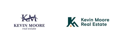
Logo Construction
I designed the color palette to feel professional, trustworthy, and modern. A deep, serious teal conveys stability and is paired with a vibrant orange accent to communicate confident action. The palette is supported by a range of versatile neutrals, including warm earthy tones and a clean light grey, that make the brand feel both grounded and sophisticated.
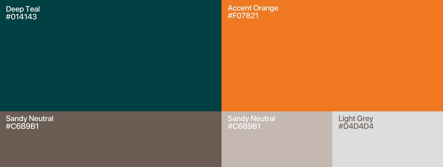

Color Palette
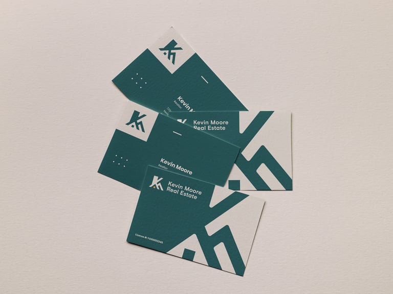
The final and most exciting step is seeing the brand come to life. Here is a look at how the brand assets I created come together, showcasing the sophisticated new designs in a series of real-world mockups.
Brand in Action
© 2025 Sandun Isuru