Dr chitra’s clinic
A brand for clinical care and online wellness.
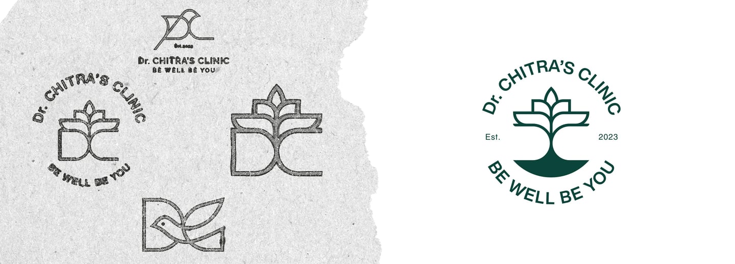
This project presented a unique challenge: creating a single logo that felt professional enough for a medical clinic yet fresh enough for a modern wellness blog. The design needed to perfectly balance trust and approachability to connect with two different audiences.
My solution was a versatile tree icon symbolizing growth and stability. The icon’s strong base feels professional, while its organic, lotus-like leaves evoke a sense of calm and wellness. By pairing a sans-serif font for the clinic’s name with a same sans-serif for the tagline, I created a balanced identity that looks established on a clinic sign, yet modern on a website.
About the Brand
I designed the color palette to balance medical professionalism with a feeling of holistic wellness. A deep teal was chosen to convey trust and calm for the clinic, while a vibrant aqua brings a fresh, modern energy to the online blog. The palette is rounded out with grounding neutral tones, ensuring the brand feels both serious and approachable.
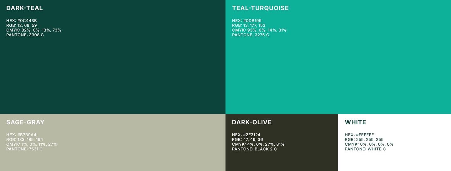
Brand colors
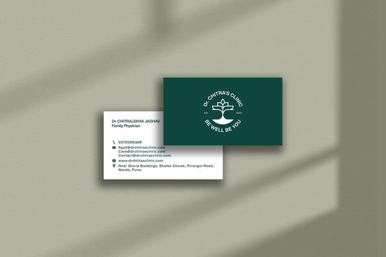
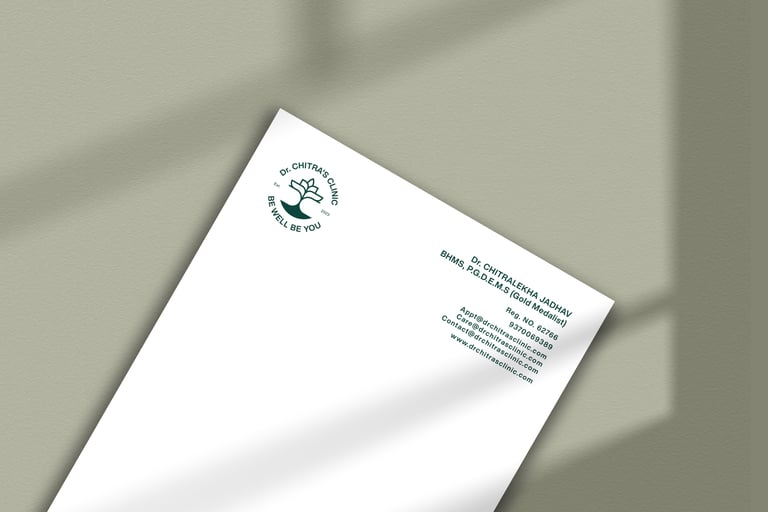
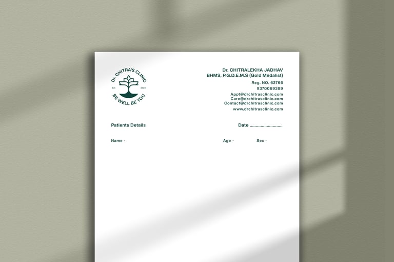
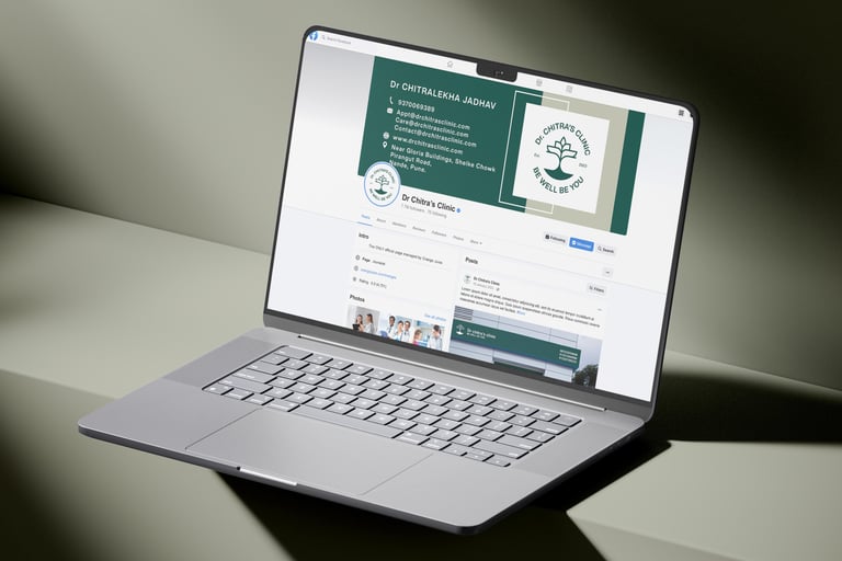
To create a complete and trustworthy brand experience, I designed key assets for both sides of the business. For the medical clinic, I developed a clean business card, an official letterhead, and a custom doctor's prescription pad to reinforce patient trust. To build its digital footprint, I designed matching social media covers and profile icons that extend the calm, wellness-focused feel of the brand to its online community.
Brand Assets
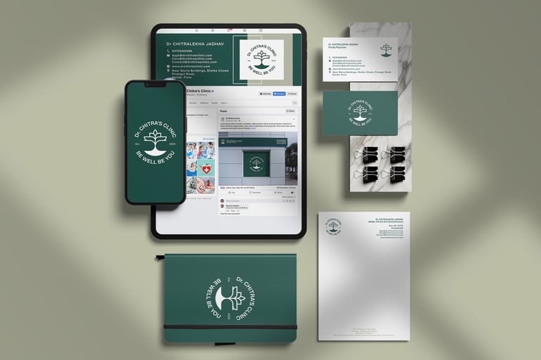
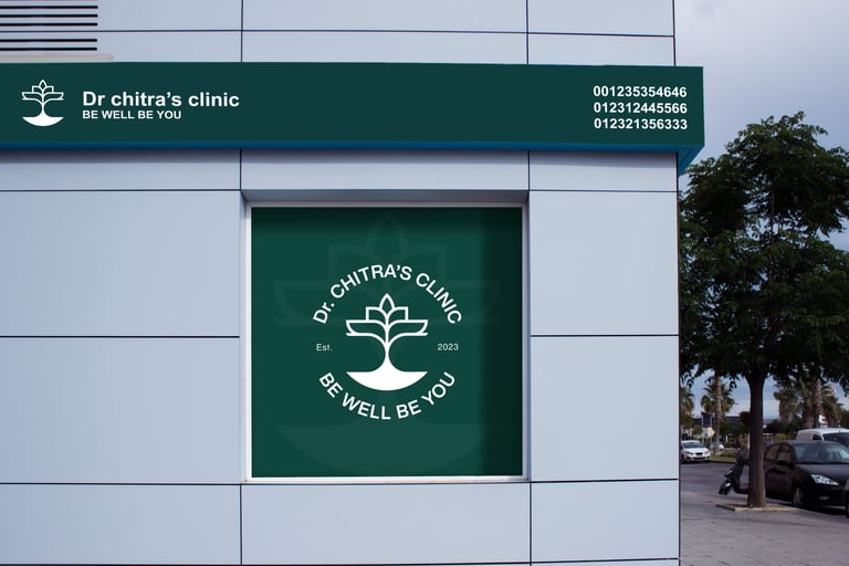
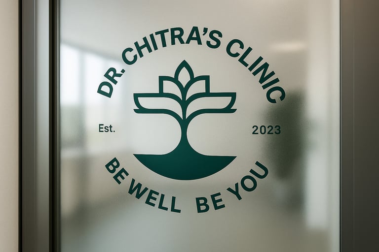
The final and most exciting step is seeing the new brand come to life. The following mockups showcase the final vision, demonstrating how the balanced identity works together to create a trustworthy and professional experience in a real-world context.
Brand in Action

"Easy to collaborate Prompt response Follows creative instructions And gets the job done."
Sangharsh Jadhav
★★★★★
© 2025 Sandun Isuru