Canary Reality
An elegant and professional real estate agency
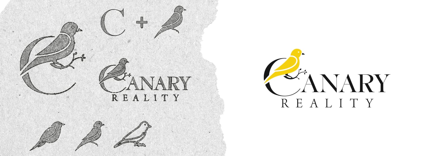
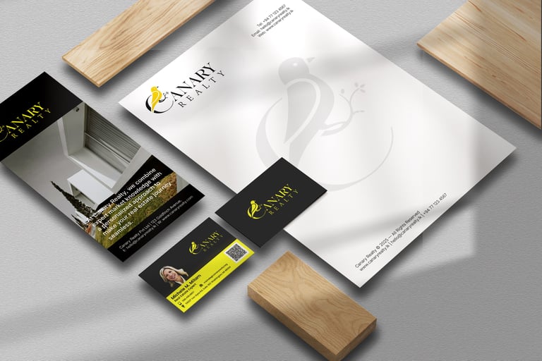
Michele was launching her independent business, Canary Realty, and came to me for an elegant and professional logo that included a personal touch: a canary. The creative challenge was to integrate the bird in a sophisticated way that would feel right for a realty company, not just a literal illustration.
After exploring several concepts, the winning solution was a unique combination mark where the icon and brand name work as one. I designed the letter “C” in "Canary" to cleverly form the clean silhouette of the bird itself. Paired with a sophisticated serif font, the final design has a classic, luxurious feel. Michele was thrilled with the result, feeling it perfectly captured the blend of personal meaning and professional elegance she wanted for her brand.
Canary Realty | Logo & Brand Identity
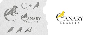
I also designed the 'C' canary mark to be a strong and versatile standalone icon. This provides Michele with a key brand asset for smaller applications, ensuring her identity is clear and recognizable on everything from social media profiles to document watermarks.
Standalone Icon
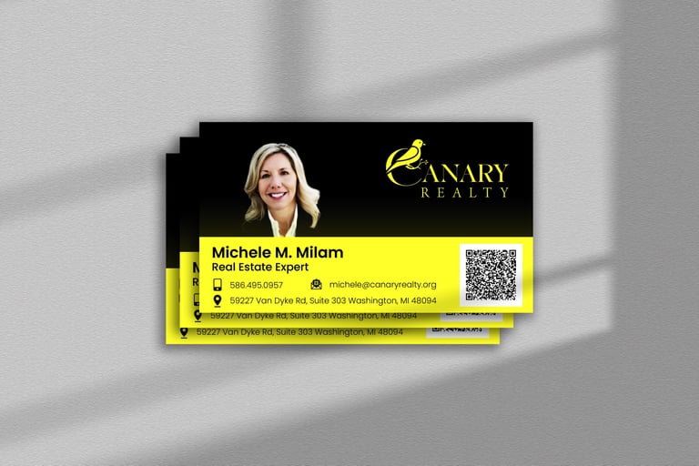
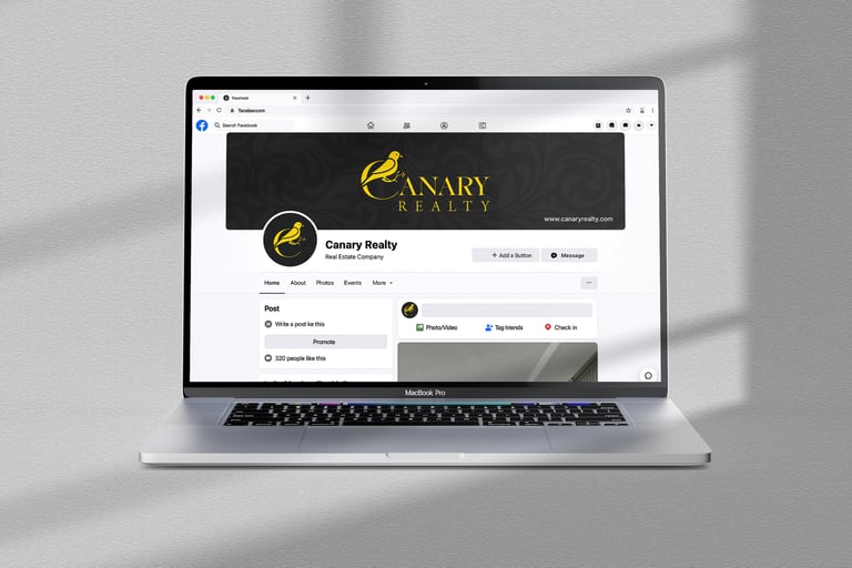
With the new logo complete, I designed a set of essential marketing materials to build out the Canary Realty brand. For print, I created a professional business card and letterhead. To establish a polished online presence for Michele, I also developed custom social media icons and a matching Facebook cover.
Brand Assets

© 2025 Sandun Isuru